Portlaoise Enterprise Centre

New Website
Portlaoise Enterprise Centre

New & Improved!
Hotdests, small and medium-sized Office Spaces, large Industrial Units, not to mention training facilities and conferencing facilities, Portlaoise Enterprise Centre has it all.
But! Looking at their old website, you wouldn’t know that. Their old website was very lacking on information and what it lacked in impact it didn’t make up for in user-friendliness.
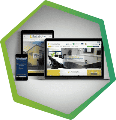
So, when we were asked in redesign it, we jumped at the chance. The first thing to go was its old monotone colour scheme, we changed the appearance of the website and we also added a lot more vital information and new navigation to make the website a lot more user friendly. We then addressed the lack of imagery and contact points for visitors to contact the centre about possible vacancies.
While all that was going on, our server engineers got to work putting in place security and anti-spam features as the old website has been the focus of many hacking attempts in the past and we wanted to make sure all unwanted activity was removed from the website.
Mobile Friendly
All our websites are…
Designed with mobile users in mind, giving them the best user experience possible.
Fully Responsive
All our websites are…
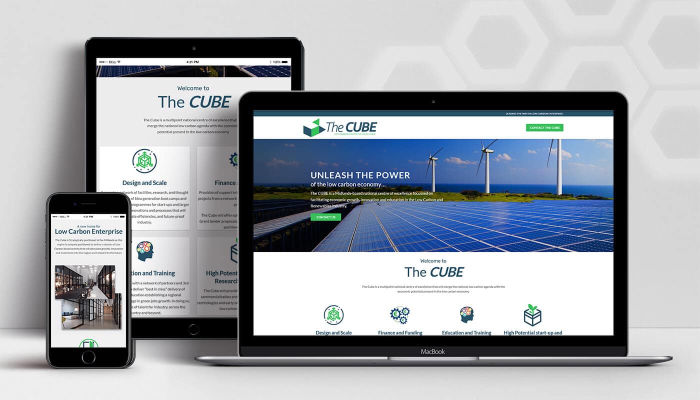
Built to adapt to the screen size of the device displaying the website.
Integrated CMS
All our websites…
Come with a full content management system (CMS) ready to go.
Marketing Ready
All our websites are…
Built ready to integrate seamlessly with any of your digital marketing needs.
Even more…
Website Projects
Take a look as some of out other website projects.


